Projects
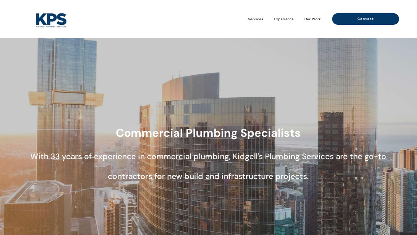
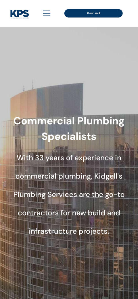
Kidgell Plumbing Services
Luciano Marcuzzi | Licenced Estate Agent
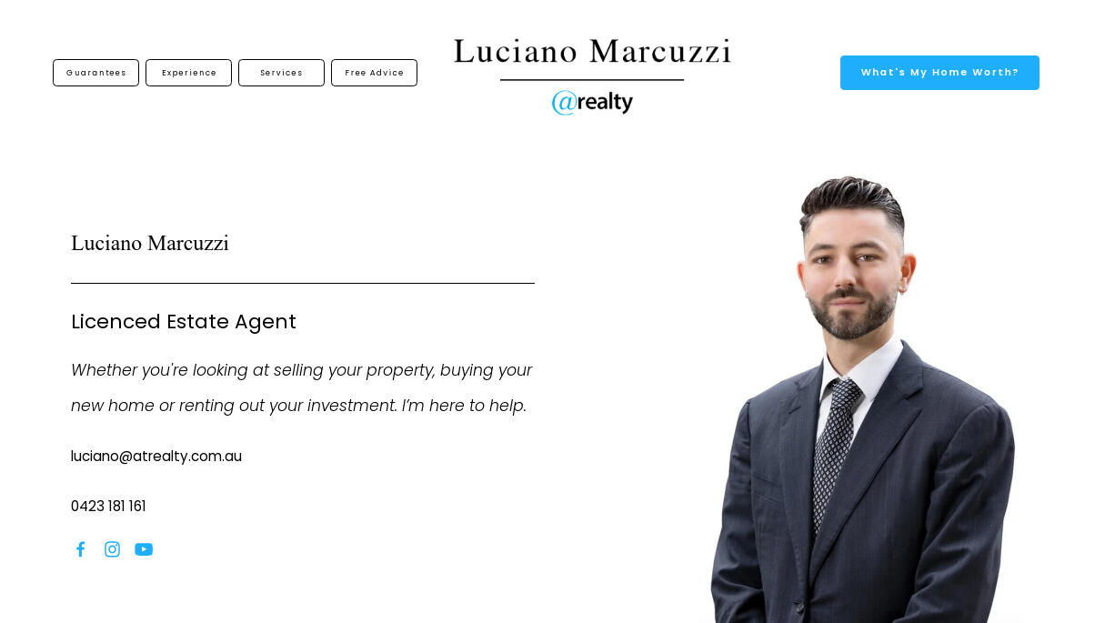
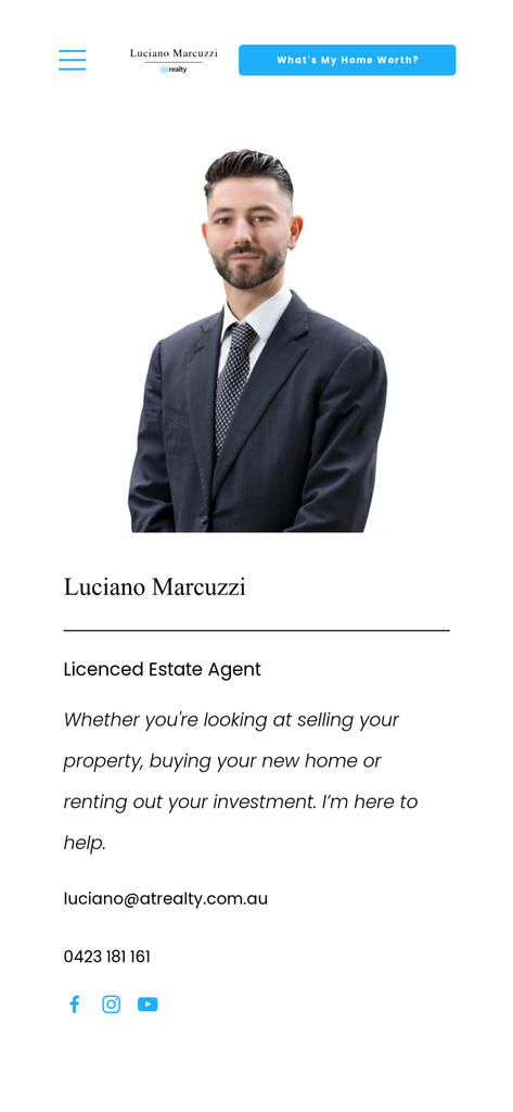
Meet Luciano Marcuzzi, a dedicated real estate agent serving the vibrant communities of Southeast Melbourne. Luciano's passion for real estate stems from his deep-rooted commitment to helping families find their dream homes and guiding them through one of life's most significant milestones. In a competitive market dominated by big agencies, Luciano stands out as an independent agent with a personalised approach and a genuine connection to his clients.
Client Background
+
Luciano isn't just another real estate agent; he's a trusted advisor, a confidant, and a local expert with a wealth of experience. As a member of @realty, a prominent real estate company, Luciano initially had a website provided by the agency. However, he came to realise that the website, while functional, didn't fully capture his unique identity or effectively communicate his value proposition to potential clients.
The original website, while informative, lacked the personal touch that sets Luciano apart in the industry. It focused more on showcasing the company rather than highlighting Luciano's individual expertise and services. Recognising the need for a redesign, Luciano approached us with a clear vision: to create a website that centred on him as the agent, resonated with his target audience, and conveyed a sense of warmth, approachability, and professionalism.
Luciano's clientele consists primarily of no-fuss, hardworking families seeking their next home. He wanted a website that reflected his down-to-earth personality and his commitment to providing personalised service tailored to each client's needs while maintaining a high level of professionalism. With a desire for a classic, straightforward design, Luciano aimed to create a digital space that felt welcoming and easy to navigate, ensuring that every visitor felt right at home.
With Luciano's story and vision in mind, we embarked on a journey to redesign his website, focusing on telling his story authentically while incorporating powerful marketing strategies to drive engagement and conversions.
Project Overview
+
In the digital landscape of today, mobile responsiveness is paramount. For Luciano Marcuzzi's website, this was not just a consideration but a cornerstone of our redesign efforts. Analytics revealed that a staggering 80% of his visitors were accessing the site from mobile devices, underscoring the critical need for a seamless and intuitive mobile experience.
With this in mind, our focus shifted to crafting a website that not only looked stunning on all devices but also functioned flawlessly, regardless of screen size or orientation. From smartphones to tablets to desktops, every visitor would enjoy a consistent and immersive browsing experience.
As we embarked on this journey, we envisioned the website as more than just a digital 'business card'. It was an opportunity to tell Luciano's story, from his humble beginnings to his current role as a trusted real estate advisor. We wanted visitors to not only learn about Luciano's expertise and services but also connect with him on a personal level.
To achieve this, we set out to streamline the flow of information, guiding users through a carefully curated narrative that highlighted Luciano's unique selling points and differentiated him from his competitors. Rather than overwhelming visitors with an abundance of information, we took a strategic approach, presenting key details at the right moment to maximise impact and engagement.
At the heart of our efforts was the goal of building trust and connection with Luciano's audience. Through thoughtful design, compelling storytelling, and strategic content placement, we aimed to foster a sense of authenticity and reliability, positioning Luciano as the go-to real estate agent in Southeast Melbourne.
Ultimately, our task extended beyond just website design. It was about creating an immersive digital experience that not only captivated visitors but also drove conversions at the opportune moment. By aligning design elements with Luciano's brand identity and business objectives, we set the stage for success in the competitive real estate market.
Design Process
+
At Complete Digital, we believe in the power of collaboration and iterative development to deliver exceptional results for our clients. Guided by Agile principles, we approach each project with flexibility, adaptability, and a commitment to continuous improvement.
Our journey with Luciano's website began with a comprehensive interview session, during which we delved deep into Luciano's story, values, and goals. We sought to understand his unique identity as a real estate agent and how we could translate this into a digital experience that resonated with his audience. From this initial discussion, three key themes emerged: professionalism, trustworthiness, and authority, balanced with warmth and relatability.
Understanding Colour Theory
Colour theory played a crucial role in informing our design decisions for Luciano's website.

Black, a colour associated with sophistication, formality, and authority, was chosen for text elements to convey a sense of seriousness and professionalism.

On the other hand, light blue, known for its associations with trust, calmness, and reliability, was selected as the feature colour for action buttons and secondary elements.
These colours were strategically chosen to evoke specific emotions and perceptions: black for conveying professionalism and authority, and light blue for instilling trust, calmness, and approachability. By carefully orchestrating the colour palette, we aimed to create a website that resonated with Luciano's goals of projecting professionalism while also maintaining warmth and approachability; we connect with the audience on a subconscious level, fostering a sense of confidence and connection.
Exploring Typeface Semiotics
In addition to colour, typography played a significant role in shaping the visual identity of Luciano's website. The study of typeface semiotics guided our font selection process.
Luciano Marcuzzi
Serif fonts, such as our selection for this project Times New Roman, are often associated with tradition, authority, and professionalism.
Licenced Estate Agent
Sans-serif fonts, like our other selection Poppins, convey modernity, simplicity, and approachability.
By leveraging the unique characteristics of each typeface, we created a design language that struck a balance between classic elegance and contemporary appeal, reinforcing Luciano's image as a trustworthy and authoritative yet approachable real estate agent.
Applying Theory to Practice
Through careful consideration of colour theory and font semiotics, we crafted a design language that not only reflected Luciano's brand identity, and the themes we extracted in our interview, but also resonated with his target audience. The use of black text and light blue accents conveyed professionalism, trustworthiness, and warmth, while the combination of serif and sans-serif fonts added depth and further reinforced the feelings of professionalism and approachability we wanted to evoke. By marrying these design elements with Luciano's story and values, we created a digital experience that not only captured his essence as an agent but also fostered meaningful connections with his audience.
In terms of design elements, we made careful decisions to ensure these themes were reflected throughout the website. For instance, we opted to have rectangular buttons with a slight rounding to marry the serif and sans serif combination further, continuing the theme of professionalism meeting approachability.
Key Features and Functionality
+
Responsive Design

Luciano's website prioritises responsiveness across all devices, ensuring optimal user experience regardless of screen size or orientation. With the majority of visitors accessing the site from mobile devices, we meticulously crafted a design that seamlessly adapts to various settings without compromising functionality or aesthetics.
Navigation Design

The website's navigation design was a collaborative effort, balancing branding preferences with data-driven best practices. With less-conventional placement of the logo in the middle of the page, we optimised navigation clarity by presenting it in a button format. This decision mitigated potential confusion among users, ensuring intuitive navigation while showcasing Luciano's branding.
Personalised Content Strategy
We implemented a personalised content strategy to cater to visitors at different stages of their property journey. The landing banner strategically features a call-to-action button, inviting users to discover the value of their home. Beneath Luciano's introduction, a concise yet impactful guarantee statement establishes trust and competence. Testimonials and a link to Luciano's sales history on reputable platforms further reinforce his credibility.
Lean and Direct Site Structure
With a focus on efficiency and user engagement, we adopted a lean and direct site structure. Contact details are prominently displayed in the landing banner, eliminating the need for a separate contact section. The narrative seamlessly flows from Luciano's introduction to his services, with lead generation forms strategically placed to facilitate seamless communication and conversion without distraction.
Lead Generation and Conversion Optimisation
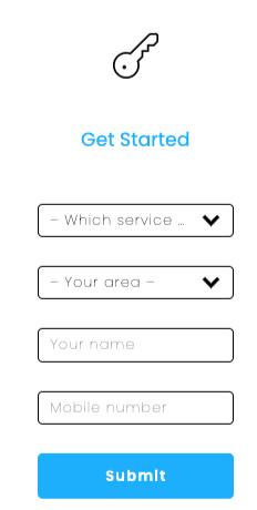
Luciano's website serves as a powerful lead generation tool, offering valuable resources and opportunities for engagement at every stage of the buyer's journey. Lead generation forms, including appraisal bookings and eBook downloads, encourage user interaction and conversion. Additionally, newsletter signups enable visitors to stay informed and connected with Luciano's latest real estate updates and insights.
Integration and Search Engine Optimisation Strategies
Integrations such as Calendly streamline appointment scheduling, enhancing user convenience and efficiency. Behind the scenes, SEO strategies, including authoritative links, relevant content, and proper tagging, boost the website's visibility and search engine rankings. By aligning content with user intent and location, we maximise Luciano's online presence and attract qualified leads.
User Experience Design
+
User Experience (UX) design is a critical component of creating successful digital experiences that resonate with users and drive meaningful engagement. At its core, UX design focuses on understanding a users' needs, preferences, and behaviours to craft intuitive and enjoyable interactions with a website.We knew the importance of a user-centric approach because it ensures that the final product would deliver solutions for Luciano's needs and expectations. By prioritising usability, accessibility, and efficiency, UX design enhances user satisfaction and fosters long-term loyalty and engagement - they key to this product's success.In Luciano's case, we put our initial assumptions to the test, gathering valuable feedback from real users to test our understanding of his audience and refine our designs accordingly.This iterative process of testing and iteration is not only central to our UX design practice but also aligns seamlessly with our Agile methodology. By embracing flexibility, adaptability, and continuous improvement, we ensure that our designs evolve in response to real feedback and deliver tangible value to our end product.Below we'll discuss the feedback from our initial user testing, and how we used that feedback to improve our product.
Navigation Design
Challenge:
The desktop navigation placement in an unconventional area led to user confusion.Solution:

We rectified this by presenting the navigation with a button appearance, aligning with UX best practices for universally understood symbols.

For mobile layout, the classic 'hamburger' dropdown was employed, providing intuitive navigation.
External Link Presentation
Challenge:
In the 'experience' section, users were confused by the 'properties sold' button, leading to distraction from Luciano's narrative.Solution:
We moved the button further down the page, after testimonials, and relabelled it as 'see our sales history at realestate.com', providing a clearer description of its function and to now align with with UX principles.
Testimonials Presentation
Challenge:
Presenting 8 testimonials in a block resulted in information overload, especially on mobile devices.Solution:
We reduced the upfront display to 4 testimonials with the option to 'see more reviews' presented as a dropdown, improving readability and user engagement.
Services Information Display
Challenge:
A long list of suburbs in the 'services' area led to user fatigue and aesthetic inconsistency.Solution:
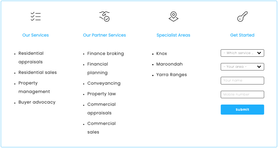
We restructured the presentation by listing Local Government Areas (totalling only 3) instead of individual suburbs, reducing clutter and enhancing visual cohesion.We also added icons to make the user experience more intuitive.
Marketing Considerations
+
We delivered a complete digital solution. In addition to creating a visually appealing and user-friendly website, we implemented strategic marketing strategies to maximise Luciano's online visibility, attract qualified leads, and foster brand awareness.
SEO Optimisation
We prioritised SEO best practices to enhance the website's visibility and search engine rankings. This included keyword optimisation, meta tags, and structured data markup to improve organic search performance and drive targeted traffic to Luciano's website.Integrating authoritative links from reputable sources, such as @realty and realestate.com.au, bolstered the website's credibility and domain authority. By establishing connections with trusted industry platforms, we enhanced Luciano's online reputation and visibility within the real estate market.Crafting compelling and relevant content tailored to Luciano's target audience addressed their informational needs and search intent. By providing valuable resources, market insights, and property listings, we positioned Luciano as a trusted authority in the real estate industry, driving engagement and establishing thought leadership.
Social Media Integration
While social media displays were not directly integrated into the website, we leveraged social media platforms to amplify Luciano's online presence and engage with his audience. By sharing valuable content, property listings, and market updates on platforms like Facebook, Instagram, and LinkedIn, we expanded Luciano's reach and fostered community engagement.
Email Marketing and Lead Generation
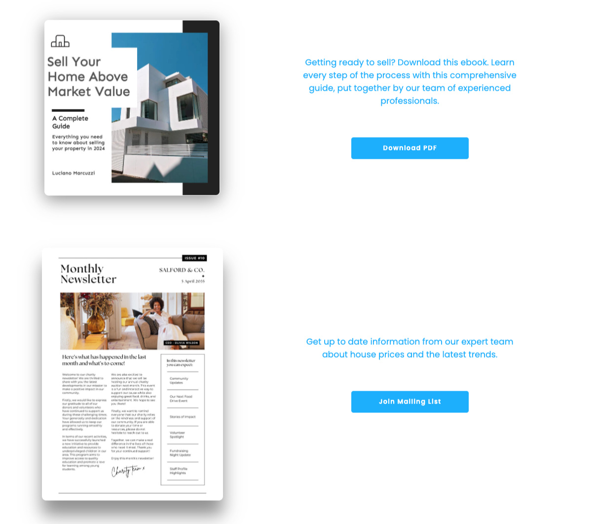
Incorporating lead generation forms and newsletter signups facilitated seamless communication and engagement with website visitors. By capturing user data and preferences, we empowered Luciano to nurture leads through targeted email marketing campaigns, delivering personalised content and exclusive offers to drive conversions and retention.
Performance Tracking and Analysis
Continuous monitoring of website performance metrics, such as traffic, conversions, and engagement, enabled data-driven decision-making and iterative improvements. By analysing user behaviour and feedback with Google Analytics and Hubspot, we identified (and can continue to identify) areas for refinement and optimisation, ensuring ongoing success and Return on Investment (ROI) for Luciano's digital marketing efforts.
What's Next?
+
In the journey of redesigning Luciano Marcuzzi's website, we embarked on a mission to create a digital presence that not only showcased his expertise as a real estate agent but also resonated with his target audience in South East Melbourne. Through meticulous attention to detail and a deep understanding of Luciano's goals and preferences, we crafted a website that embodies professionalism, trustworthiness, and warmth while delivering an exceptional user experience.From the outset, our commitment to user-centric design guided our decisions, ensuring that every aspect of the website—from navigation to content presentation—was optimised to meet Luciano's audience's needs and expectations. Through iterative testing and feedback loops, we refined our designs, challenged our assumptions, and implemented solutions that enhanced usability and engagement.Strategic SEO tactics and marketing strategies further amplified Luciano's online visibility and reach, positioning him as a trusted authority in the real estate industry. By prioritising relevant content, authoritative links, and seamless lead generation mechanisms, we empowered Luciano to connect with potential clients, nurture leads, and drive conversions effectively.As we reflect on the journey, it's clear that our collaborative efforts, informed by UX design principles and Agile methodology, have culminated in a website that not only meets but exceeds Luciano's expectations. Moving forward, we remain committed to continuous improvement, leveraging data-driven insights and emerging trends to ensure that Luciano's digital presence continues to evolve and deliver tangible results for his business.In conclusion, Luciano Marcuzzi's website stands as a testament to the power of thoughtful design, strategic marketing, and unwavering dedication to client success. We are honoured to have been part of this transformative journey and look forward to continued collaboration and success in the future.
If you enjoyed learning about our design approaches and have any questions—or if you're inspired to embark on a website redevelopment journey of your own—please don't hesitate to get in touch with us at [email protected].We're passionate about crafting digital experiences that resonate with your audience and drive meaningful results for your business. Let's collaborate to bring your vision to life and make an impact in the digital landscape. We look forward to hearing from you!
